 OPMay 30, 2020·2 repliesiCarly Japan
who you talking about? Im not on discord


what u think?
 May 30, 2020PleaseDelete
 at least you tried
 May 30, 2020
KTT united

- Hi-C 🦌May 30, 2020·1 replydat guy
what u think?
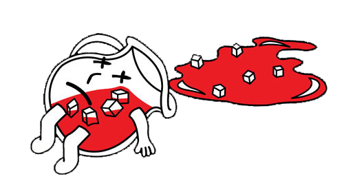
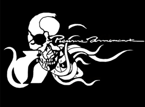
This s*** is so raw. Just slap a parental advisory on it raw, no title none of that s***. The cover speaks for itself. It’s minimal but it’s f***ing raw. I love this s*** so much
 May 30, 2020·3 replies
lmaoooo
- Hi-C 🦌May 30, 2020·1 replyzzounn
lmaoooo
Kinda f*** with this too. Even more minimal. This probably the second one I f*** with the most
Edit: only criticism is rounded edges and the shadow effect kinda corny. Just make that s*** fully minimal and no shadows or s***
- Hi-C 🦌May 30, 2020
Sorry for the edit lol, kinda snagged your like oops
- Hi-C 🦌May 30, 2020
I dig the concept though, the parental advisory being like that is so tight though, I love that s*** so much
- OPMay 30, 2020·1 replyHi-C
This s*** is so raw. Just slap a parental advisory on it raw, no title none of that s***. The cover speaks for itself. It’s minimal but it’s f***ing raw. I love this s*** so much
S*** needs a title tho fam
- Hi-C 🦌May 30, 2020·edited
I also think it’s fire cause you could juxtapose that s*** with it being similar to older photos from the civil right era but it being current cause of the Volkswagen. Like first glance you might think it’s some old ass photo possibly but the Volkswagen is a subtle indication that it isn’t. S***s so hard though
- Hi-C 🦌May 30, 2020·1 replydat guy
S*** needs a title tho fam
I mean Yeezus got a title, so does TPAB. But the covers themselves speak for itself without a title you feel?
- OPMay 30, 2020·1 replyHi-C
I mean Yeezus got a title, so does TPAB. But the covers themselves speak for itself without a title you feel?
You got a point my guy

- Hi-C 🦌May 30, 2020dat guy
You got a point my guy
I’m bias because minimalism is my s***, like I admire that more than anything. But I think sometimes allowing for interpretation and letting s*** speak for itself is great.
Regardless, dope f***ing image homie
- May 30, 2020·2 repliesHi-C
Kinda f*** with this too. Even more minimal. This probably the second one I f*** with the most
Edit: only criticism is rounded edges and the shadow effect kinda corny. Just make that s*** fully minimal and no shadows or s***
the shadow and rounded edges were only for the sake of presentation, and not intended as an actual design choice regarding the cover itself

- OPMay 30, 2020·1 replyzzounn
the shadow and rounded edges were only for the sake of presentation, and not intended as an actual design choice regarding the cover itself
OK dis hard

- Hi-C 🦌May 30, 2020zzounn
the shadow and rounded edges were only for the sake of presentation, and not intended as an actual design choice regarding the cover itself
Bet. This s*** is insanely clean. Nice work bro, you got a good eye for this s***. Hard as hell
- May 30, 2020·edited·1 replydat guy
OK dis hard
i think we should use it since the textless parental advisory sticker was created by a ktt member, and this could be the album artwork to debut it
would definitely make the whole release more memorable
- May 30, 2020dat guy
what u think?

 May 30, 2020zzounn
lmaoooo
Dude from the other thread might’ve did something with that new PA design

Works really well in this context
 May 30, 2020·1 reply
I sense a classic
- May 30, 2020zzounn· edited
i think we should use it since the textless parental advisory sticker was created by a ktt member, and this could be the album artwork to debut it
would definitely make the whole release more memorable
The rollout for this project is gonna be insane
- May 30, 2020
Hard tbh
- OPMay 30, 2020zzounn
lmaoooo
How this look like if you remove the shadow?
- OPMay 30, 2020
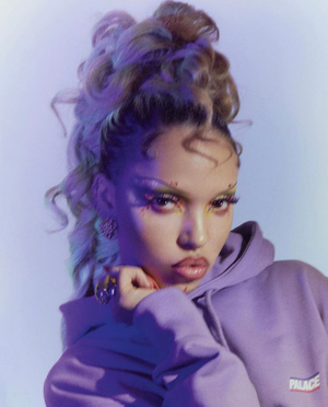
 ASAKI
ASAKIwith the text @dat_guy

This hard asf